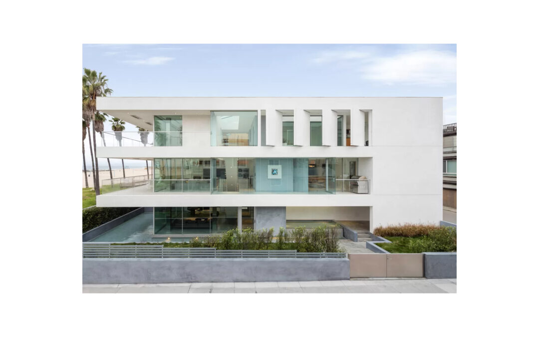
From our friends at Bosch!
When it comes to designing the perfect space, I believe that the details are often the most important piece of the puzzle. As an architect, this forces me to think both large and small. Not only must I envision the overall aesthetic, but also the finite details that work harmoniously together to create that specific look and feel. Without that commitment to the details, we run the risk of serious design and construction flaws, and a finished product that leaves a lot to be desired.
For example, if an architect doesn’t really study how a window integrates into a building, the whole structure could be off. The details can also have a direct impact on the quality of life of the inhabitants—take for example, the effects of an uncomfortable handrail, or an ill-placed light switch. To illustrate how great design stems from the details, I’m going to walk you through a series of home projects by my firm, Dan Brunn Architecture. With each project, I’ll chat through the inspiration, challenges, and detailed choices my team made to create the final product. Ready to dive in?
The Flip Flop House
To this day, this project is very special to me and my firm. I was only 27 when we took on the Flip Flop House and it really turned out to be a breakout project for my team. One of my favorite parts about this home is the detailed geometric shapes that we established, and how we then played with negative space through large cutouts in the home.
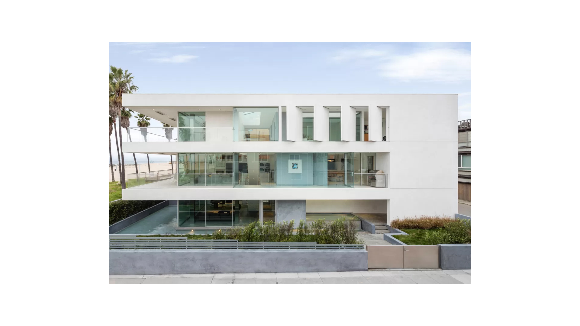
On a big picture level, the client wanted a beautiful space that provided plenty of opportunities to take in the scenic ocean views, but he also wanted something that was exquisitely modern, displayed his stunning art collection of photo prints, and mirrored the choreography of human movement when walking throughout the home. To accomplish just this, we made a series of creative choices including stunning wraparound balconies and gorgeous interior gardens. One of my favorite features, and what led to naming the home the “Flip Flop House,” were the paneled wall-doors (pictured above) that pivot back and forth to showcase the stunning outdoor view, while also displaying hanging art prints on the interior. By addressing every detail of the space, we were able to collaborate and build something truly meaningful.
My Los Angeles Home
This one is very personal – it’s my own home in Los Angeles! I found a property with great bones, but knew that I wanted to drastically change the interior to make it my own. For me, the most important details to sort out were what stays and what goes. I remember taking the initial tour of the space and seeing potential. In the “before” photo below you can see that the floorplan was very closed off. I instantly opted to eliminate the attic and create this airy space that captures a fun and whimsical aesthetic. This one detail created an utter transformation.
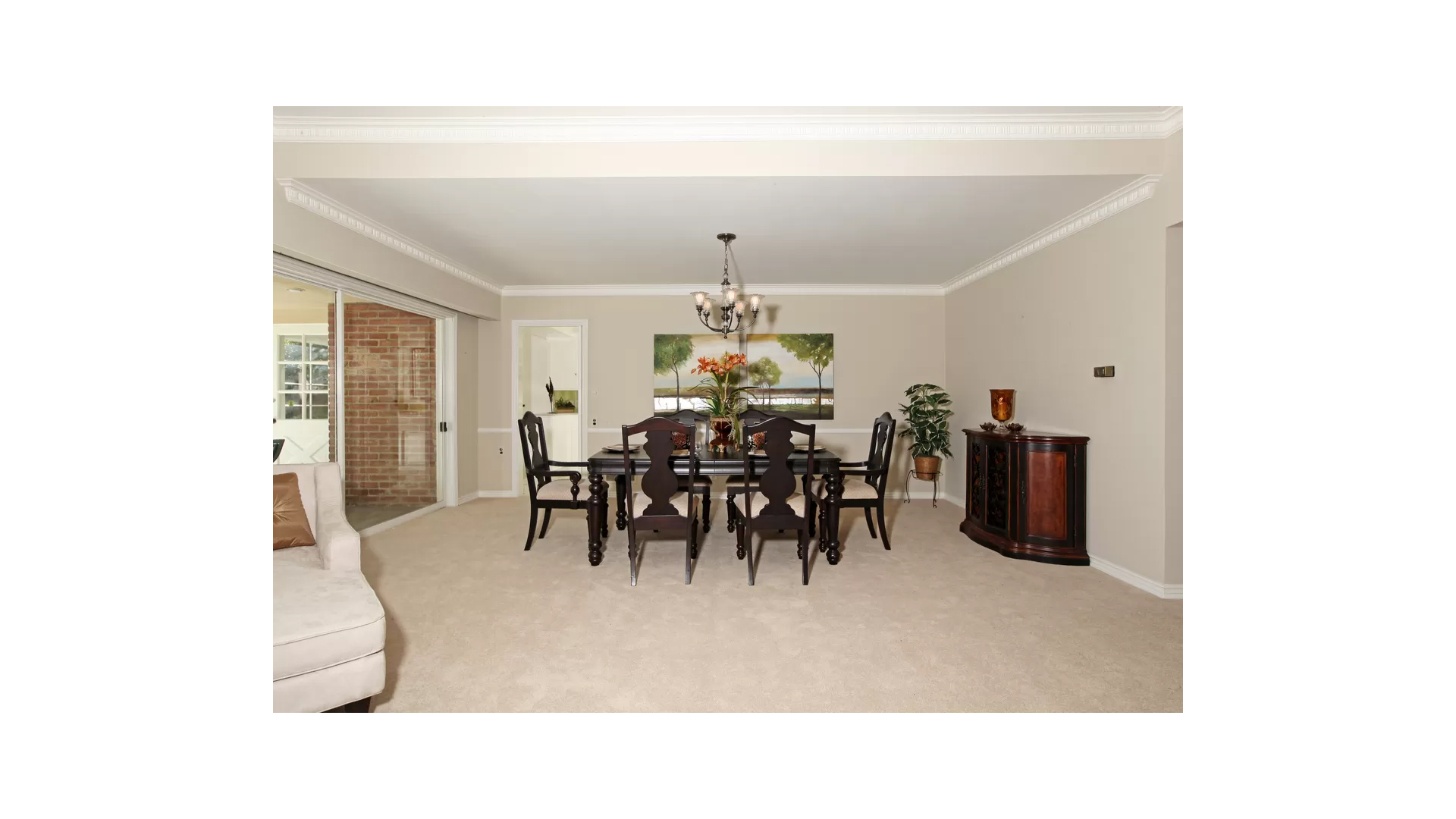
One of the things I love most about this project is that it is rooted in simplicity. I opted to keep the exterior design as-is for a few reasons. For starters, I love the contrast between the older exterior and sleek, modern interior – it’s quite a surprise when you walk inside the front door! But even more importantly, I made this choice because really, “less is more.” While I constantly stress the importance of even the smallest details, I also think it’s vital to make sure that those choices serve a direct purpose – speaking to the essence of “purposeful design”. This attention to the important details allowed me to create a modern retreat that perfectly speaks to my point of view and lifestyle.
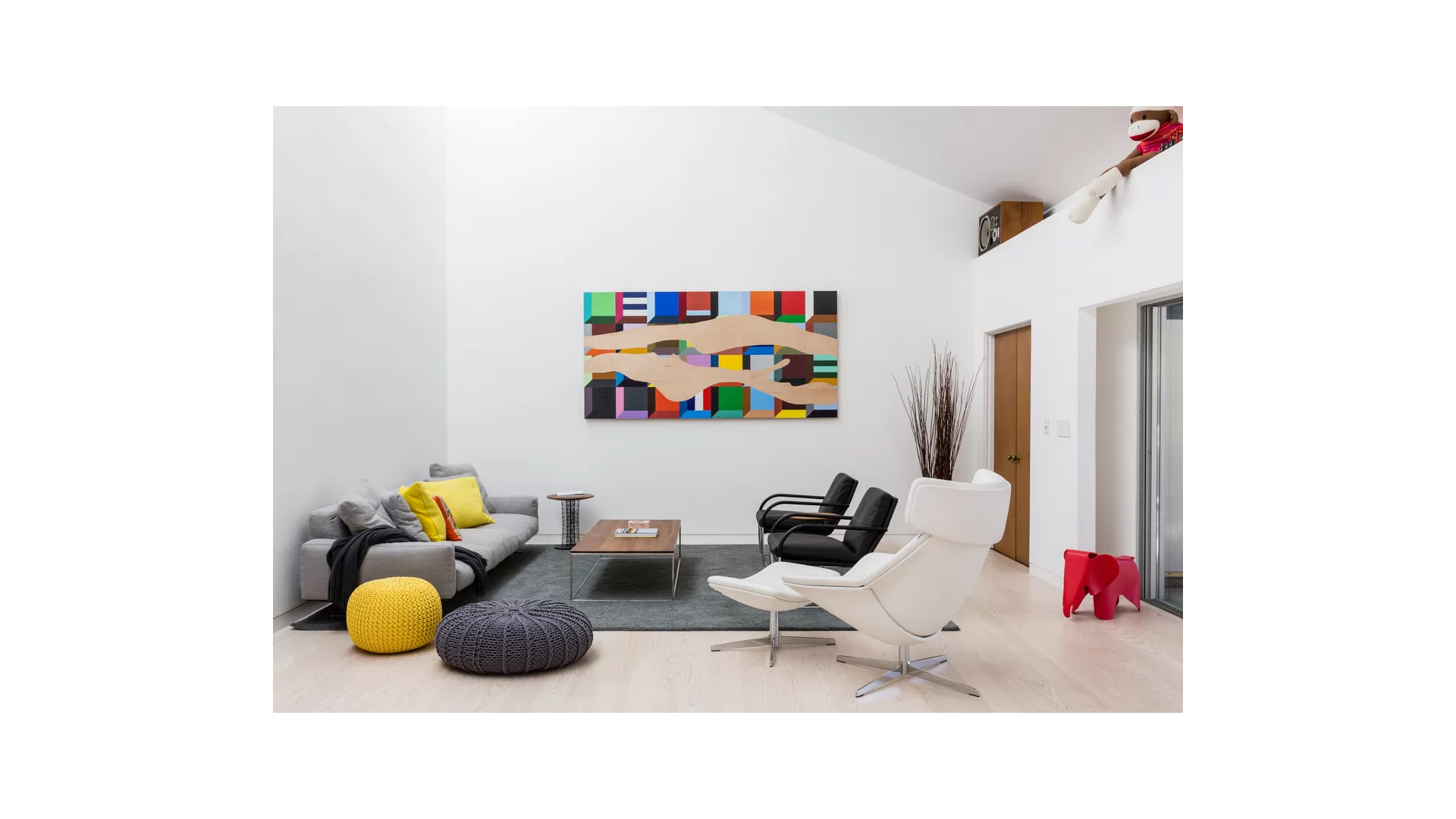
After Dan Brunn’s modern retreat.
Nichols Canyon
And lastly, I want to revisit the Nichols Canyon project that I collaborated on with Bosch. Our goals for this project were two-fold – to honor the original mid-century architecture of the structure, but also modernize aspects of the home to better serve the lifestyles of its inhabitants. To deliver on these goals, we had to sift through a variety of details, many of which related to the kitchen.
To start, we knew opening up the floorplan was a must. This one choice elevated the space in so many ways – the home instantly felt airier. On any given day, the homeowner can grab a cup of coffee in the kitchen, appreciating the breezy trees hovering above the home and sprinkling of sunlight that pours in on a sunny Los Angeles afternoon.
We knew that the suite of Bosch appliances would perfectly balance the fresh and clean aesthetic of the interior space. I truly appreciate that with Bosch you aren’t just getting “statement pieces” that look nice. There’s a level of exploration as the user realizes that every last detail on a Bosch cooktop or refrigerator impacts and improves the kitchen experience. Creating an immersive and consistent experience for my clients is extremely important to me, and I think this is just another reason why incorporating Bosch into this project was so authentic.
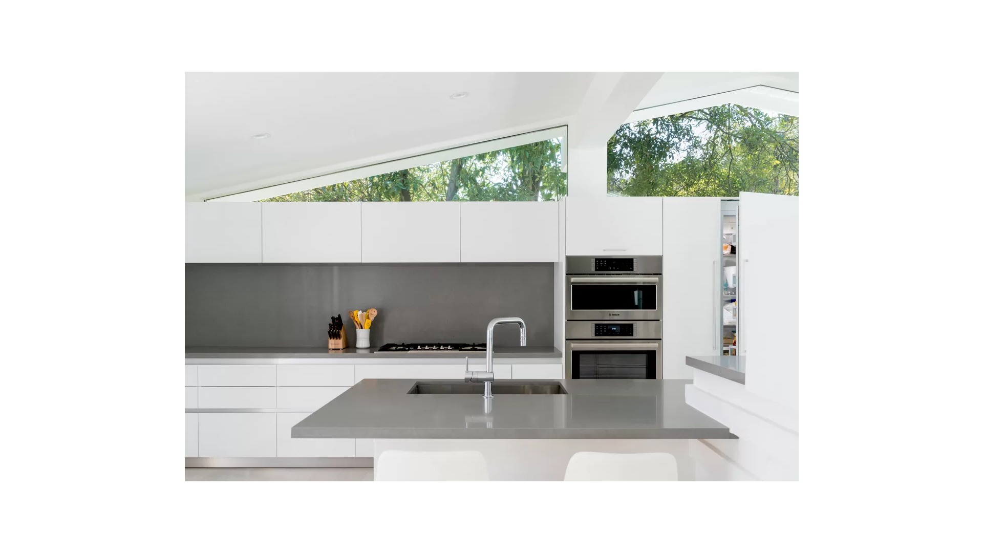
Bosch kitchen appliances perfectly balance the fresh and clean aesthetic of the interior space.
I love taking a moment to think back on all the amazing projects I’ve worked on over the years. Each new space provides fresh challenges and opportunities, but it’s consistently the critical details that pull each project together in a unique way. I hope this helped inspire some creative thinking for your next kitchen project.
Dan Brunn is a brand partner for Bosch home appliances. For more information on the award-winning architect, visit www.danbrunn.com.
To read the details please check out the Bosch blog post here!

